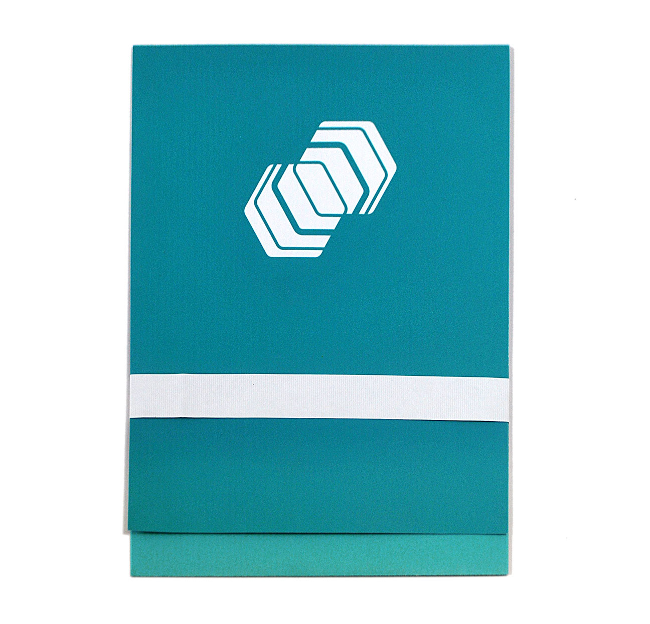
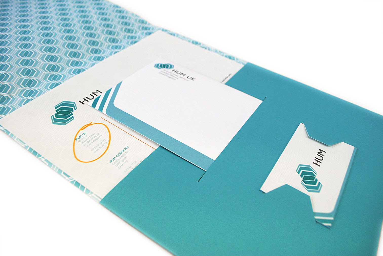
The complete folder for Hum's stationery suite. Includes letterhead, envelope, and business card. The inside of the folder is printed in a tiled pattern created from the logo, while the front is emblazoned with the logomark in white. An orange color is used minimally in the suite—it is not seen anywhere on the outside of the folder. These orange elements are revealed only after suite items are removed from the folder. In this case, the vertical dividing line on the letterhead and the circled address are your only clue.
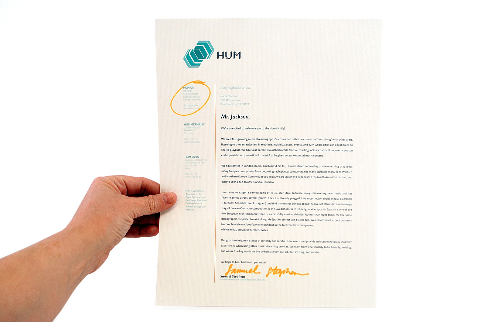
The letterhead for Hum's stationery suite. Because Hum is a global company, with offices in the UK, Germany, and Spain, their letterhead includes all three addresses on the left. The employee using the letterhead simply circles their respective office when they sign the letter. It is economical to only use one design for the whole company, and it also gives the receiver of the letter more information on Hum. The letterhead is printed on paper with subtle vertical blue lines, with the goal of creating a sense of vibration and "humming."
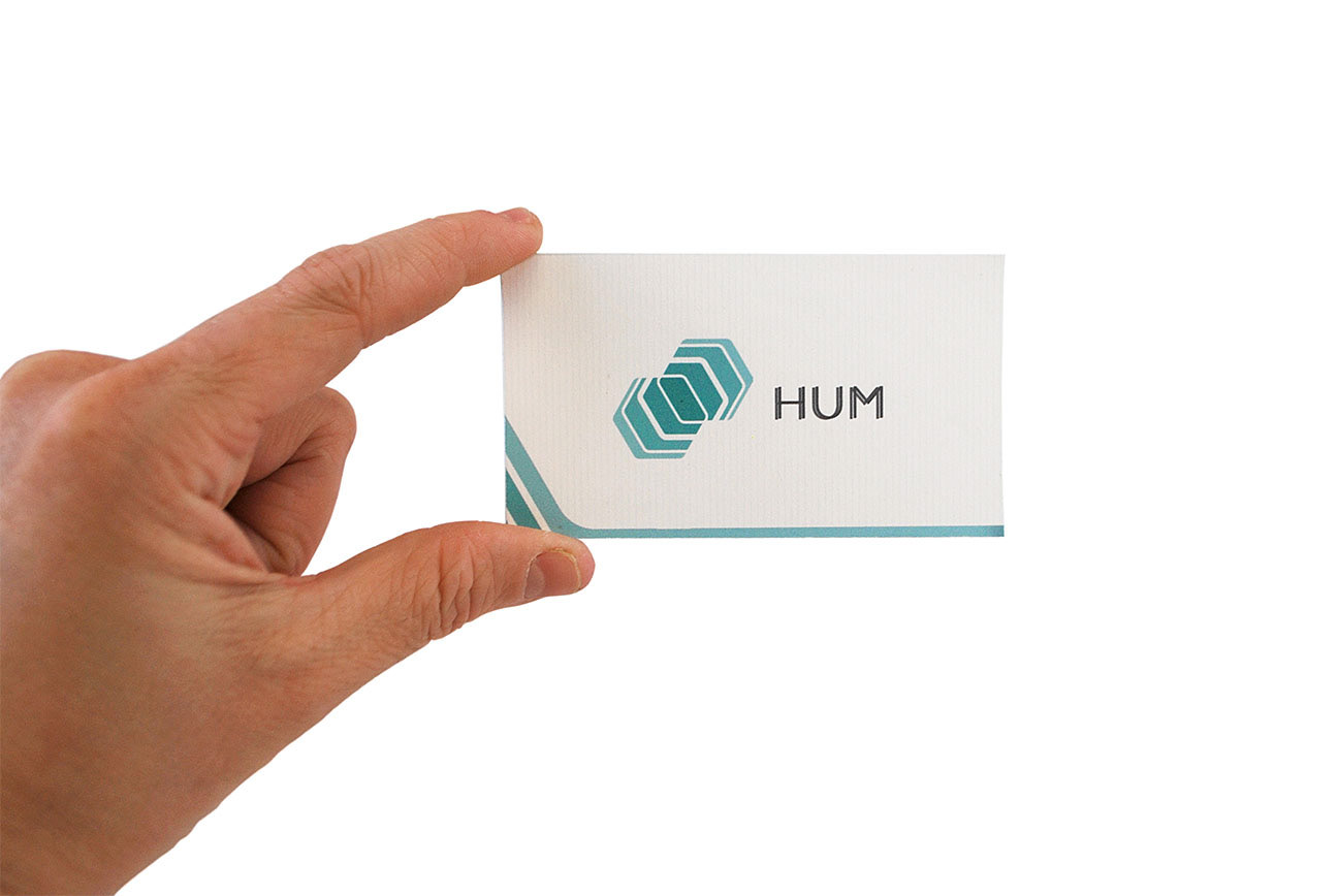
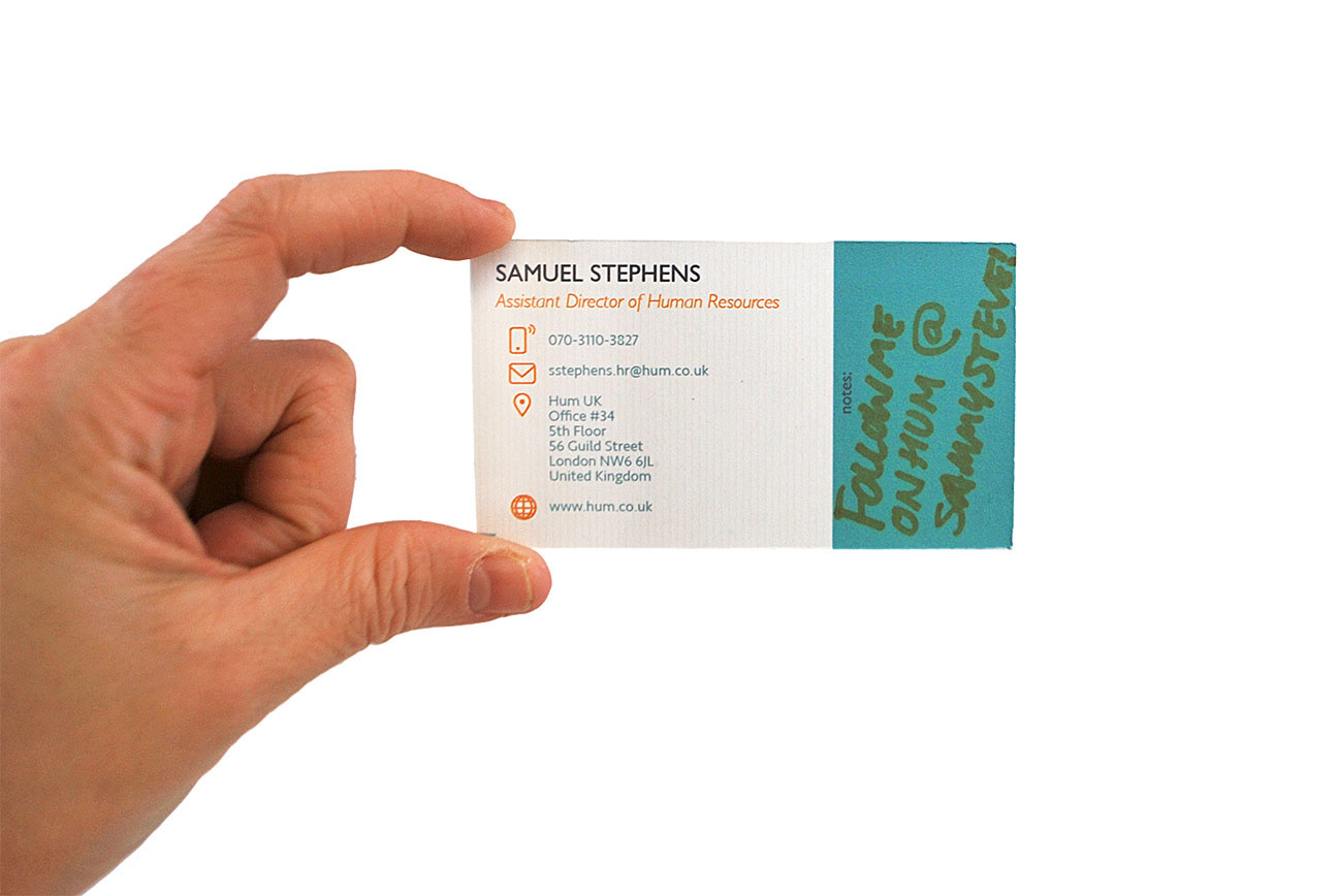
The business card for Hum's stationery suite. Printed on the same paper as the letterhead, this card is also supposed to have a subtle visual vibration. On the front is the logo and wordmark for Hum, with enlarged angular elements from the logo creating a bottom border. These elements are used again to border the envelope. On the back of the business card, orange elements are introduced, as secondary text and simple icons developed by the designer for the company. The right third of this side of the business card is left for notes, written by either the owner or the receiver of the business card.

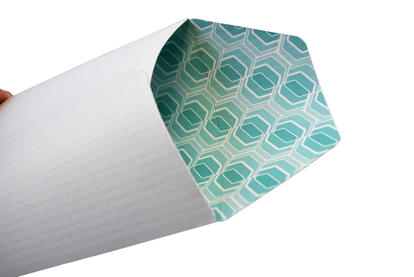
The envelope for Hum's stationery suite. This envelope is printed on white textured paper, with the interlocking pattern printed inside. The flap comes from the hexagonal shape of the logo, and features the text, "hum along with us!" with Hum's website written beneath. The border from the business card is echoed here, and the envelope is self-addressed.
———————————————————
When it came to developing stationery for this company, I started with thinking about how to visualize sound and the concept of humming. The logo can be read as two hexagons interlocking, sharing a space, sound waves spreading from a point, or even a nod to the shape of honeycombs, homes to bees who are known for making "humming" sounds. The materials I used all involve lines, with the letterhead and the business cards being printed on paper with faint blue lines running throughout, creating a subtle beat in the background. Most popular music platforms do not use teal colors, which allows Hum to stand out.
