- FEATURED IN THE 2017 AUBURN UNIVERSITY GRAPHIC DESIGN STUDENT SHOW, JURIED BY JIM BULL OF MOVING BRANDS -
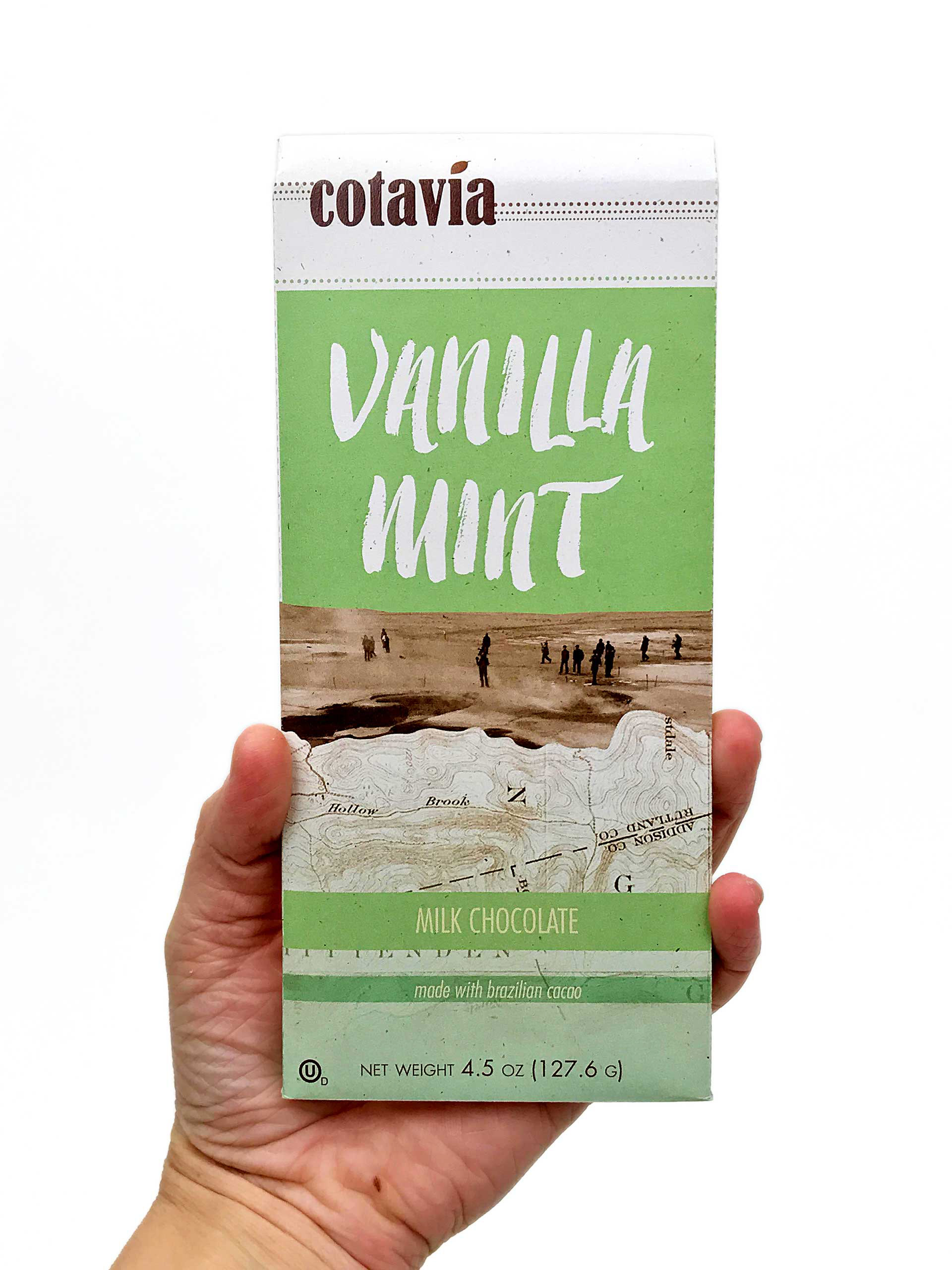
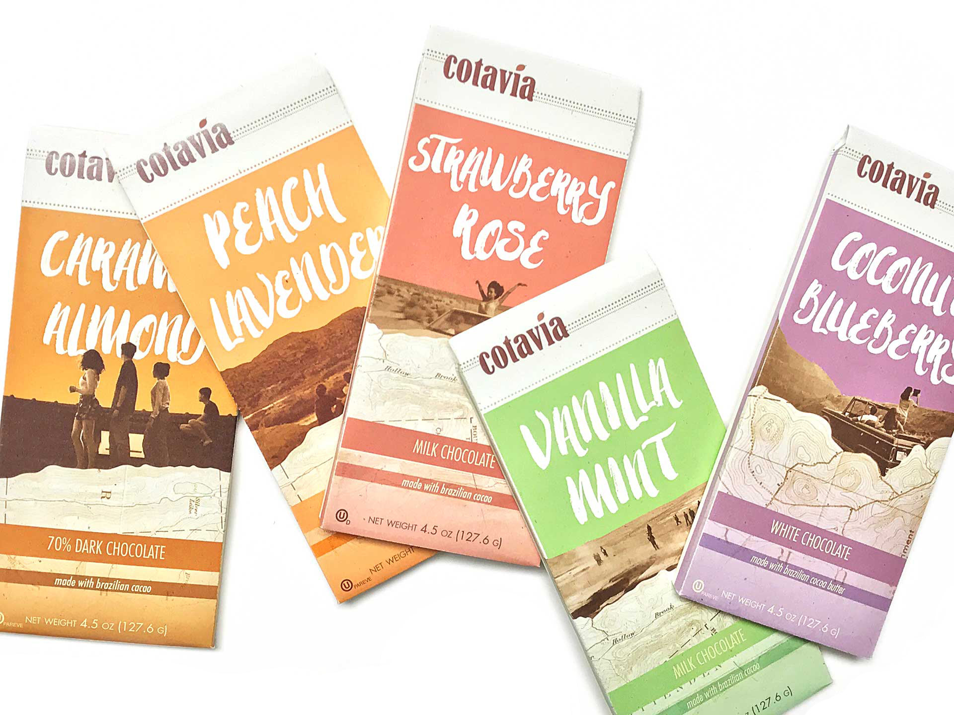
The front of Cotavia chocolate bars. The colors are inspired by each chocolate's flavor. The photos featured on the front of each bar are travel photos submitted by customers. These photos are then paired with topographic maps. The organic lines of the header type are balanced by the condensed type of the body copy. The envelopes are printed on an off-white recycled paper that contains flecks of brown, furthering the sense of connection to the environment Cotavia hopes its audience has.

On the back of each Cotavia bar envelope is the Cotavia Story. The tag line for the company, "go on a lark," is centered on the flap, with an asterisk after "lark". The definition of lark is given underneath, with the brand story below. Cotavia was developed to be a sub-brand underneath the Clif Bar & Company parent company, since they both encourage their customers to be adventurous.


These five flavors of chocolates come in a "Variety Pack" box from Cotavia. The box is made out of recycled material, and customers are encouraged to recycle it again. The back of each box features a tip on how to re-use your envelopes—this one encourages customers to use them to send a letter to a friend. The side panels of the box are cut out, giving you a window to the product. Below the window, colorful lines continue the stripes on the side of each bar.
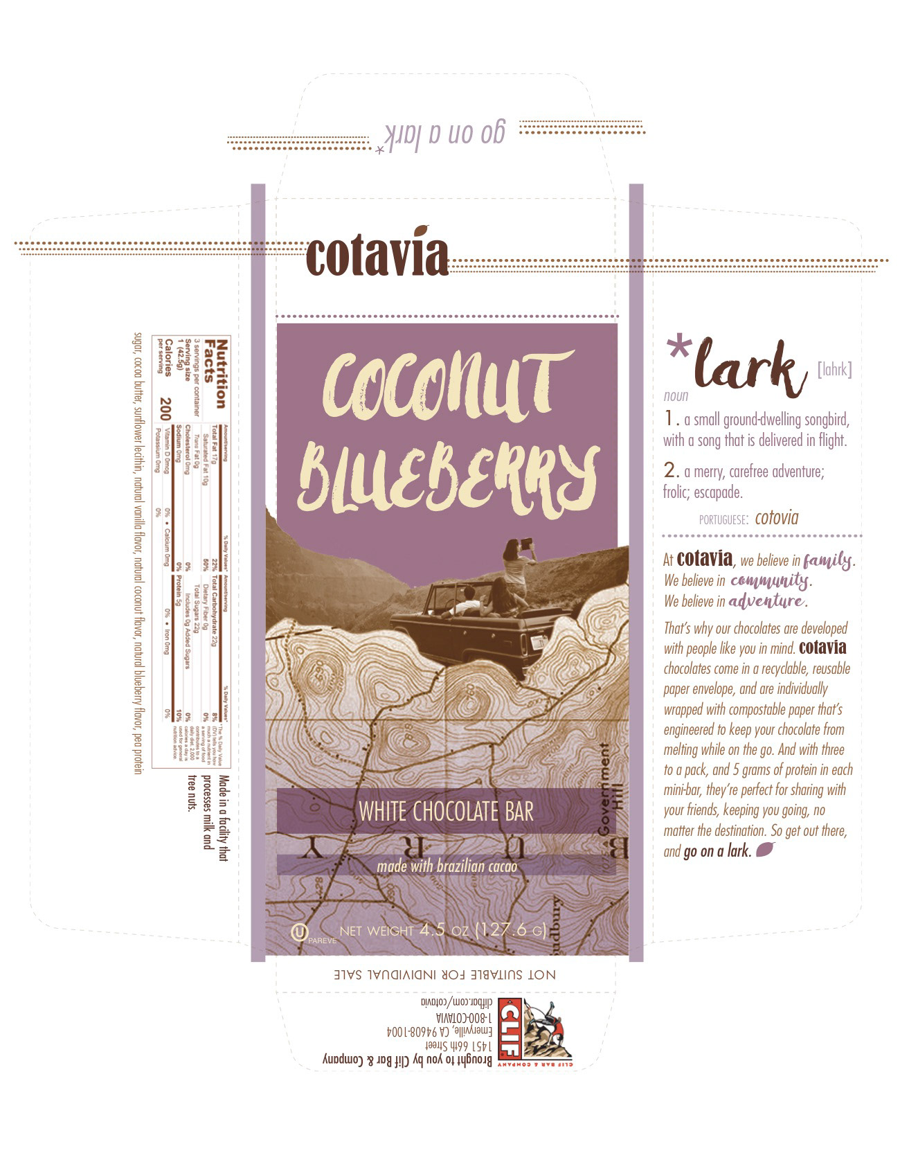
The full envelope design for Cotavia's Coconut Blueberry flavor.