
- FEATURED IN THE 2017 AUBURN UNIVERSITY GRAPHIC DESIGN STUDENT SHOW, JURIED BY JIM BULL OF MOVING BRANDS -
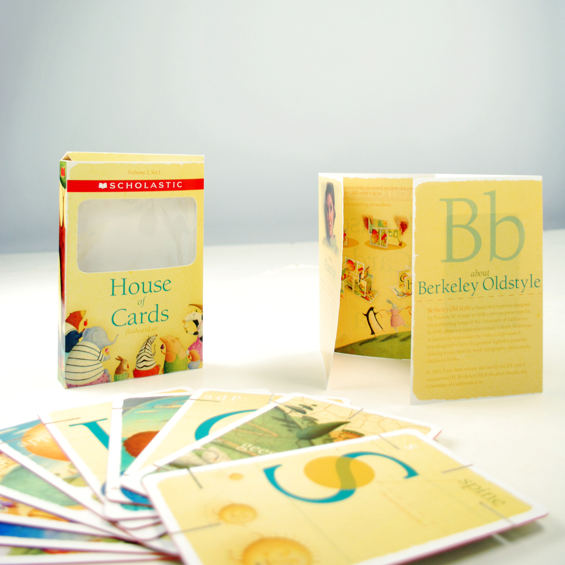
The full box set. Every piece was crafted by hand.
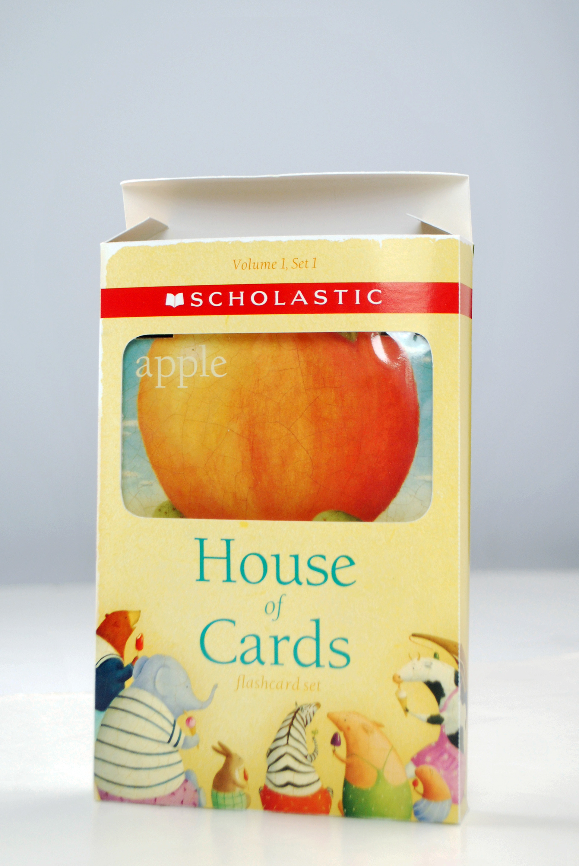
These animals, clipped from an illustration by Allison Jay, stare up at the window cut in the front of the box. They are fun and inviting characters.
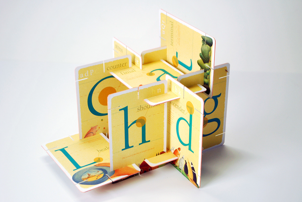
Assembly of the cards, typography side out. The back of each card features letter forms from Berkeley placed on a rule, inspired by the paper young kids use when first learning to write. The red dashed line is consistent through each design and denotes the x-height of the typeface. In the top corners of the cards, other letters that feature this anatomy are highlighted. The illustrations used on this side of the cards were mostly digital collages, using many individual elements clipped from illustrations by Allison Jay. The "t" card, for example, features trees. This soft-looking forest was composed out of at least twenty different trees Jay has painted.
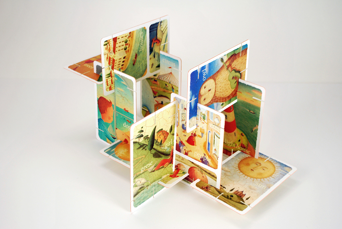
Anatomy of the cards, image side out. Each card features either one or two illustrations by Allison Jay. These cards work on image and sound recognition. For example, one card features an illustration of a girl tending a flock of geese. On the other side of the card, the letter "g" is featured, with imagery of geese flying in a V-formation accompanying it. These illustrations, pulled from Jay's vast portfolio, are colorful, engaging, and beautiful to look at.
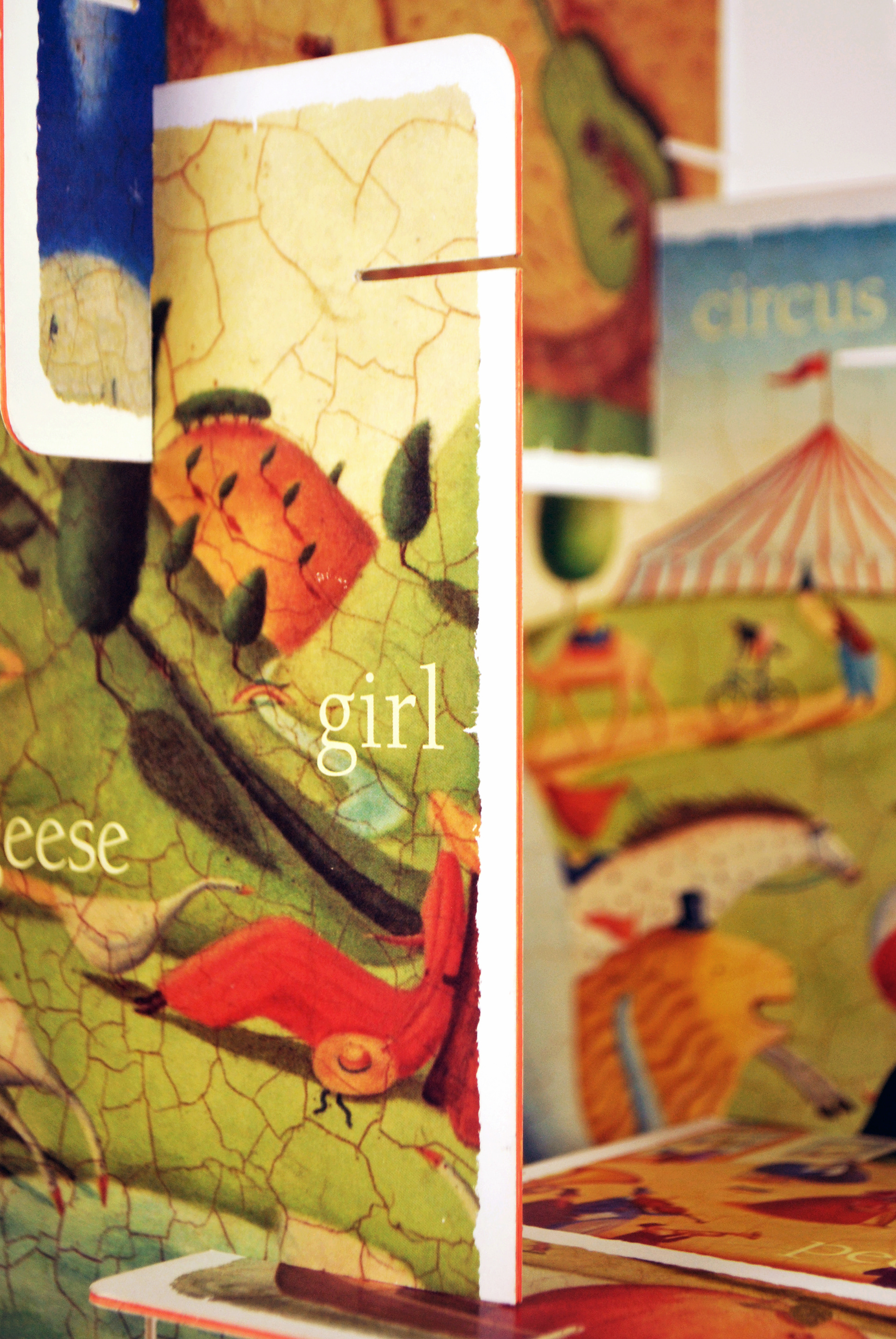
Close up of the built structure.
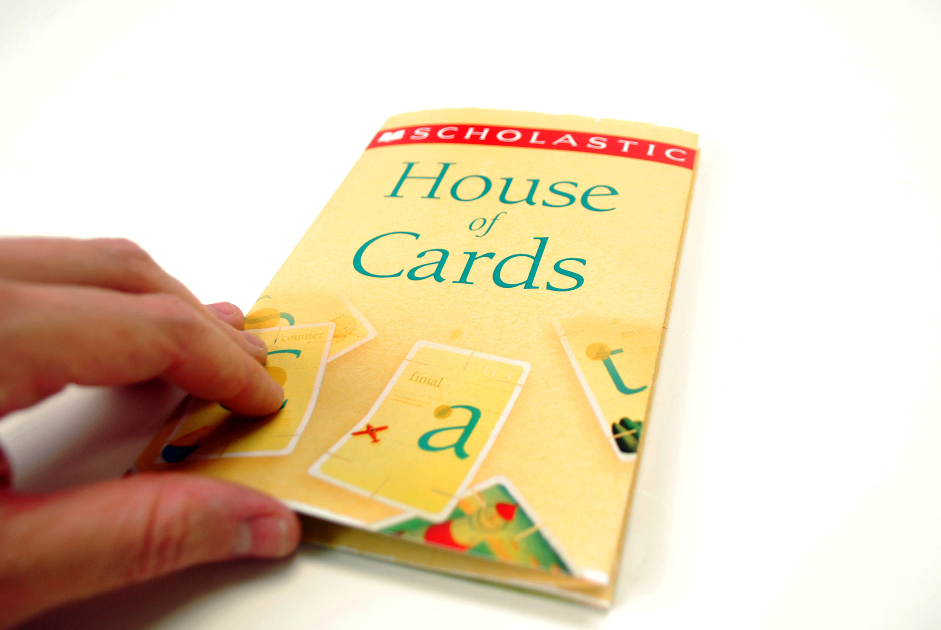


The box set comes with a booklet, explaining what the cards are, what each card features, and how you can put them together. The booklet was designed using original photography. On the back, other works by Allison Jay and Scholastic are featured, along with a credits list for all the images used on the cards. Upon first being opened, the booklet also contains a short biography of Jay and a history of Berkeley. This House of Cards was designed to ideally be part of a much larger product set; other card sets would feature different letters, typefaces, and illustrators. On the inside of the booklet is a small baseball card, saying what letters came in this set. On the back of the card is a full bleed illustration by Jay.
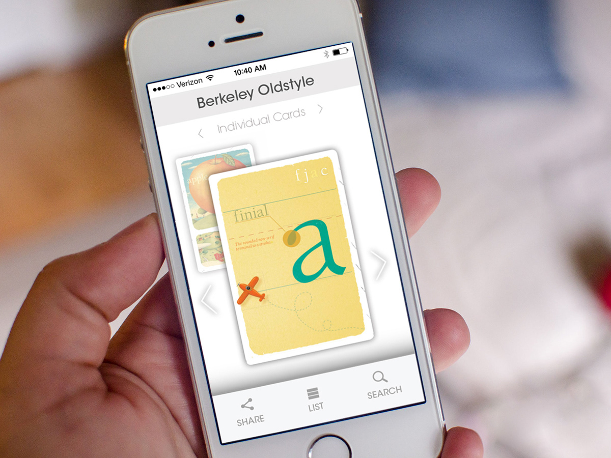
In the final part of the project, students were assigned groups, and worked together to develop app mockups that would feature all the card sets. In this app, card sets are sorted by typeface. Upon clicking the typeface of their choosing, users can flip through all the cards in the set, clicking on the foreground or background image to view different sides of the cards.