Poster created while a student at Auburn University, Fall 2017. The dominant feature of the poster was to be a handcrafted collage. To me, beauty can be found in everything, and I wanted my collage to reflect that. Using strips from various catalogs and magazines, the collage is almost like an I-Spy game. Fine art, food, animals, nature, physical beauty, the abstract ideas of joy and wonder——all are represented here, arranged in an eye-catching color spectrum. The text "ON BEAUTY" was added after the collage had been scanned in, as if the letters were slotting between the strips of the collage. I wanted the text of the poster to operate as secondary and tertiary elements, aligned carefully at the bottom of the page.
- FEATURED IN THE 2018 AUBURN UNIVERSITY GRAPHIC DESIGN STUDENT SHOW, JURIED BY GAIL ANDERSON -
———————————————————
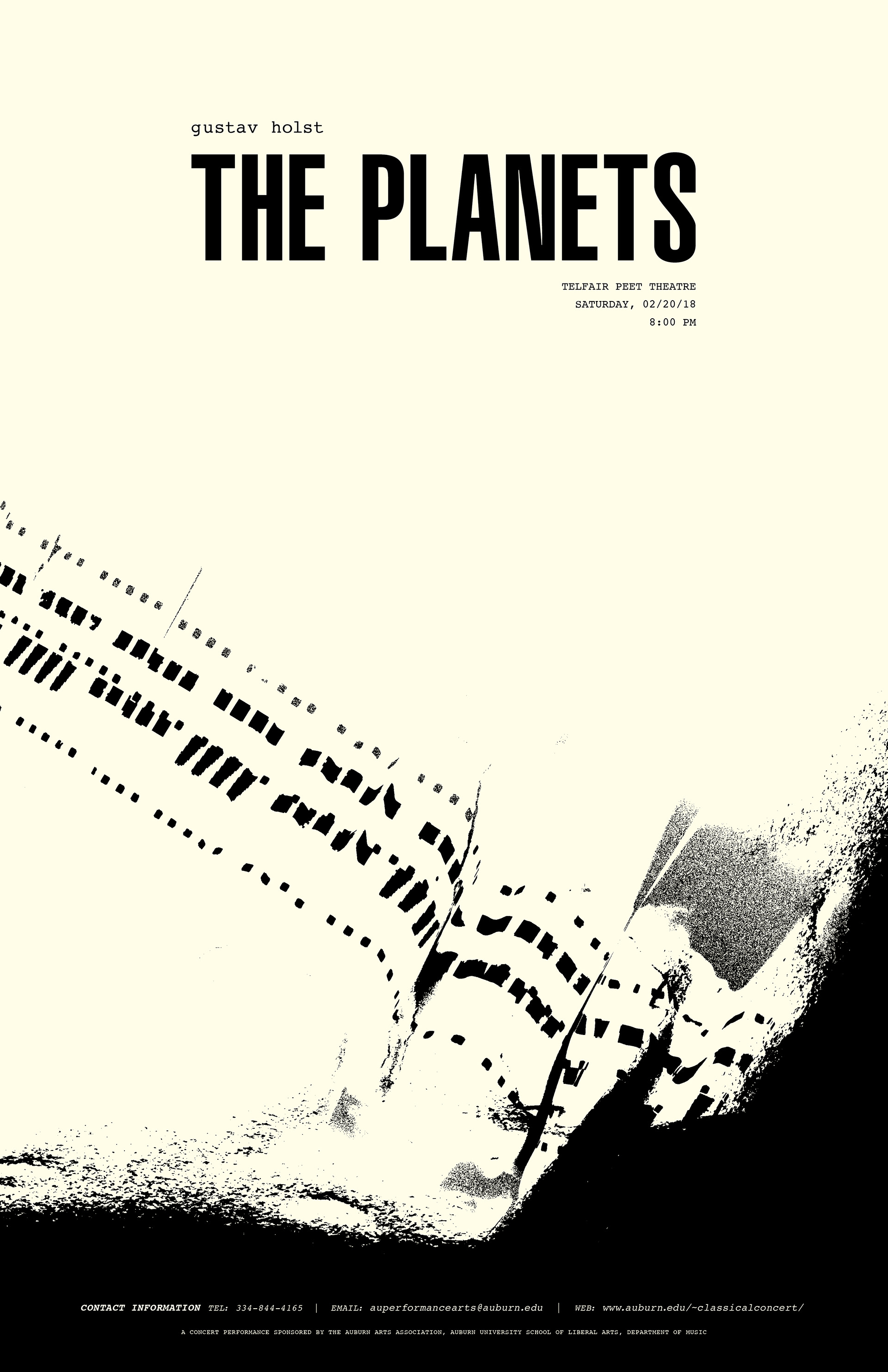
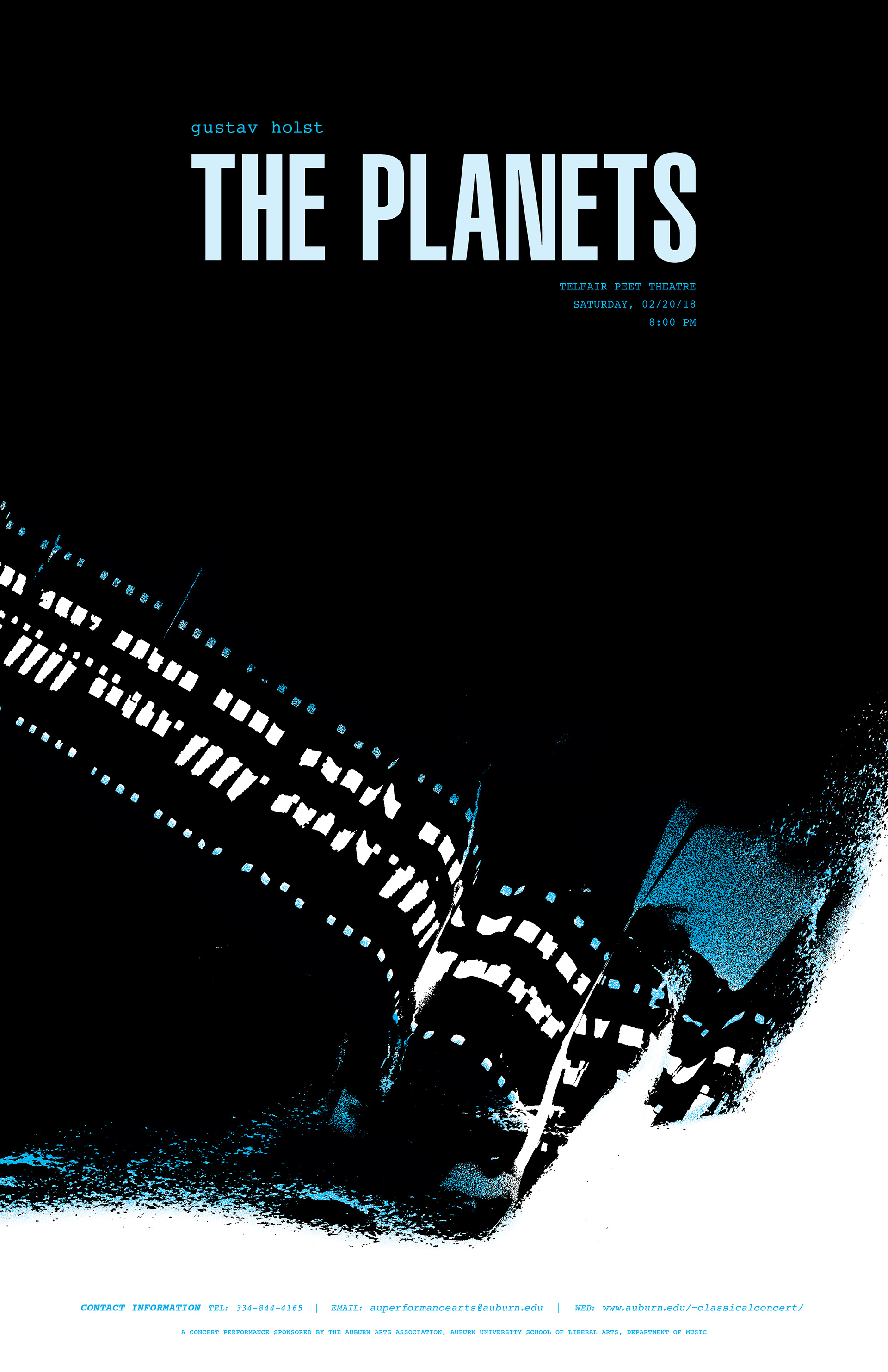
Posters designed while a student at Auburn University, Fall 2017. Students in listened to a song they were given no context for, and began sketching in response to it. The song was "Mars: Bringer of War", from Gustav Holst's "The Planets" symphony. Our image was to reflect the feeling of "Mars" and use typography compared with image to do so. In the song, a steady beat comes to a ghastly, dramatic end. The image portion of this poster shows a "steady beat" of periods and semicolons dive into the frame and be consumed by a warped, gritty, violent end, created with a very physical process of printing, scratching, tearing, folding, and scanning. When added to the full poster's format of 11x17, the added negative space above creates an atmospheric quality to the design. Given the new context of representing the whole "Planets" symphony, the steady beat becomes planets in orbit, through space, through time. "Mars" has a cinematic quality to it——my first thought was that it was from a movie soundtrack. I designed my header type to reflect that and have a visual connection to movie posters, with contact and other information being delegated to the bottom of the frame. Pictured here are the final poster designs, in black and white and two-color.
- FEATURED IN THE 2018 AUBURN UNIVERSITY GRAPHIC DESIGN STUDENT SHOW, JURIED BY GAIL ANDERSON -
———————————————————
Poster advertising the release of a new book, designed while a student at Auburn University, Spring 2018. Rebels: A History of Unconventional Fashion, features several women throughout history who made an impact with their personal dress. This poster is one of a series——while this one features Josephine Baker, other posters in the series will feature women such as Frida Kahlo and Gluck. All posters will include a bright yellow background with white header text reading "we have ALWAYS been here", and a high-quality black and white cut-out image of the featured woman in the foreground. To go with the title "Rebels," images of the women should show them in irreverent poses, a new look on women who are usually depicted as poised and put together. Yellow symbolizes energy, remembrance, and positivity. Each poster will also have a paragraph with a short biography of the featured woman that leads in to the information given about the book and its release. The logo for Beacon Press, the publishing company for Rebels: A History of Unconventional Fashion, will always be anchored in the bottom left corner.
———————————————————
———————————————————
Poster celebrating the Seventy-Fifth Anniversary of the Auburn Student Creed, designed while a student at Auburn University, Spring 2018. Each student designer was assigned a language; posters had to include the full text of translated version and the English version of the Creed. I was assigned French. In my research, I discovered that Shug Jordan, legendary Auburn football coach, carried a copy of the Creed with him as he stormed the beaches of Normandy on D-Day. Jordan was injured by German shrapnel and had to undergo surgery. Throughout this whole ordeal, the words of the Auburn Creed gave him hope to carry on. I can imagine him reading the Creed to his fellow soldiers, someone softly translating it into French so everyone could understand. The history of this Creed and it's relationship to France was too stunning to me to not be at the forefront of my design. I created the central "artifact" by typesetting the Creed in Courier, printing it on old yellow paper, and weathering it by hand——it was folded, scraped, scratched, rubbed in the dirt, crumpled, tea-stained, ironed, and crumpled again.
———————————————————
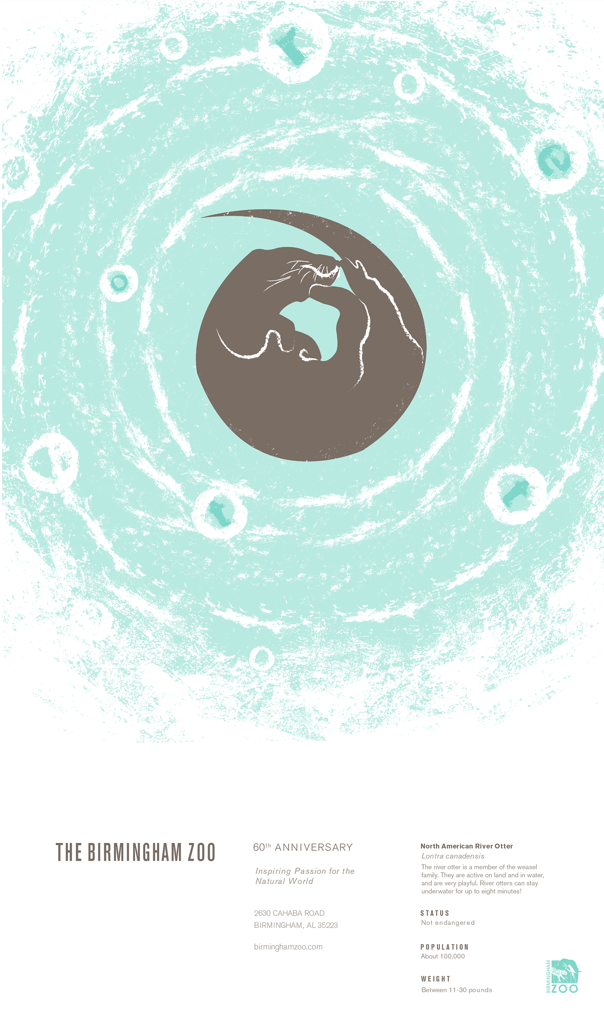
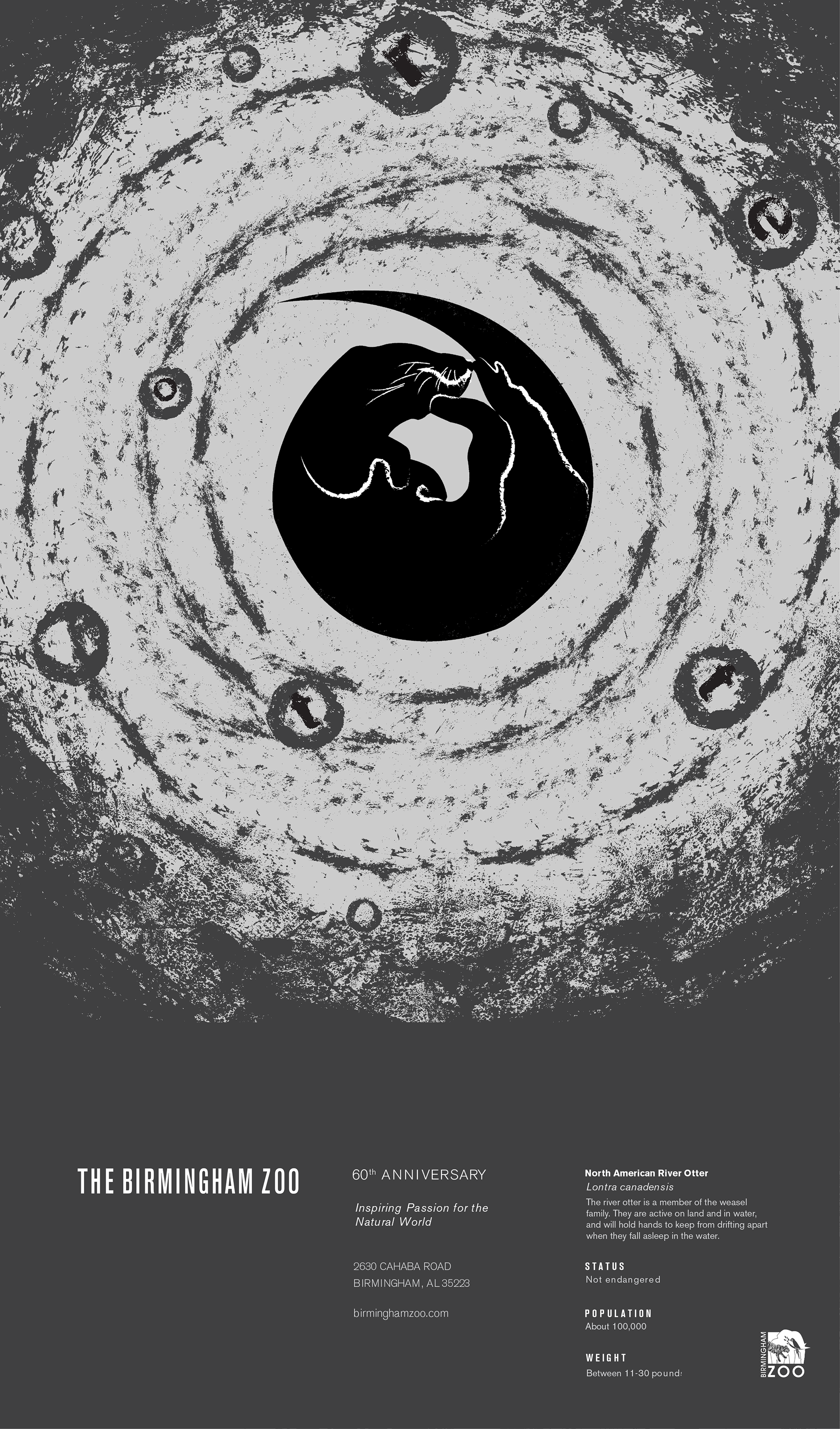
Poster for the Birmingham Zoo, designed while a student at Auburn University, Spring 2016. Each student was assigned an animal to base their design on. Process for the poster included relief printing the name of the animal with chipboard and collecting textures by taking rubbings of different surfaces. I layered multiple textures and created a design of watery concentric circles for the otter to rest in the center of. Letters spelling out "otter" are arranged in white rings, meant to signify bubbles, and can be read moving counter-clockwise around the image. Final designs had to include a three-color version and a black-and-white version.
- FEATURED IN THE 2016 AUBURN UNIVERSITY GRAPHIC DESIGN STUDENT SHOW, JURIED BY ANN WILLOUGHBY -
———————————————————
